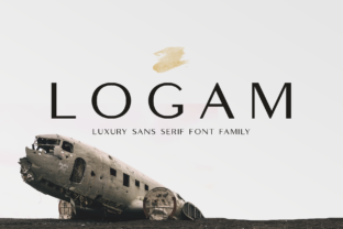
Logam: A Modern Sans Serif Font for Digital Clarity
As a UI designer who ships dozens of landing pages, SaaS dashboards, and e-commerce experiences each year, I reach for fonts that do more than look clean—they need to perform. Logam is one of those rare sans serif fonts that balances quiet confidence with functional precision. Its low stroke contrast and subtly squarish letterforms—especially in rounded characters like “o”, “e”, and “c”—give it a grounded, contemporary presence without sacrificing legibility at any size.
What sets Logam apart isn’t novelty—it’s restraint. Unlike high-contrast geometric sans serifs that can feel sterile or overly rigid, Logam maintains gentle openness in its counters and consistent x-height across weights. That means your users don’t pause to decode a headline. They absorb it. On mobile screens, where vertical space is scarce and attention spans are shorter, Logam’s even rhythm supports rapid scanning—critical in hero sections, pricing cards, and feature grids.
Where Logam Earns Its Place in Your Layout
Logam shines strongest where clarity and tone converge: hero titles, section headers, CTA buttons, and branded content blocks. Its medium weight holds up beautifully on light backgrounds, while the bold weight gains authority on dark mode interfaces or image overlays—no halo effect, no visual vibration. I’ve used it for boutique online store banners where product names need to feel intentional but not aggressive, and for coaching websites where warmth and professionalism must coexist. In those contexts, Logam avoids the coldness of ultra-minimalist fonts while staying far from the informality of rounded or handwritten alternatives.
It’s less ideal as body copy at small sizes—like 14–16px paragraph text—unless paired with generous line height and spacing. But that’s by design: Logam is a sans serif display font built for impact, not endurance. Think of it as your brand’s voice in the first three seconds of a visit—not the narrator for the entire story.
Building Visual Hierarchy Without Overcomplicating
In conversion-focused layouts—think course sales pages or app onboarding flows—I use Logam to anchor key moments: the headline above a signup form, the benefit-driven subhead under a feature icon, the button label that closes the loop. Because its letterforms avoid extreme geometry or exaggerated terminals, Logam scales predictably across breakpoints. A Logam Bold headline at 48px on desktop remains crisp and stable at 32px on tablet and 28px on mobile—no reflow, no awkward truncation.
That consistency strengthens perceived brand trust. Users subconsciously associate typographic reliability with product reliability. When your logo, navigation, and primary CTAs all speak in the same tonal register—clean, calm, confident—they reinforce a unified digital identity. Logam doesn’t shout. It invites focus.
Smart Pairings for Real Projects
Logam pairs naturally with neutral serif fonts for editorial depth—like using it for headlines alongside a warm, humanist serif (e.g., Lora or Playfair Display) for blog posts or case studies. For pure digital products—dashboards, admin panels, internal tools—I often pair Logam with a highly legible, open-source sans serif like Inter or Manrope for body text. The contrast is subtle but effective: Logam provides character; the secondary font delivers neutrality and performance.
Avoid pairing Logam with other geometric sans serifs unless you’re intentionally creating tension—for example, a tech startup leaning into structured innovation might combine Logam’s soft squareness with a tighter, more technical typeface for data labels. But for most brand-focused web experiences, simplicity wins: one strong display font, one clear workhorse font.
Practical Considerations for Web Deployment
Before integrating Logam into your next project, verify what’s included: at minimum, you’ll want Regular, Medium, SemiBold, and Bold weights—with true italics, not algorithmic slants. Check for OpenType features like tabular numerals (essential for pricing tables), localized glyphs (if serving multilingual audiences), and variable font support for smoother loading and responsive weight shifts. Most reputable vendors deliver WOFF2 files optimized for web use, along with CSS snippets ready for @font-face declarations.
And yes—license carefully. If you’re embedding Logam in a client’s WordPress site, Shopify theme, or SaaS platform, confirm whether your license covers commercial deployment, dynamic rendering (e.g., in email templates or PDF invoices), and redistribution via digital templates. Some licenses restrict usage in editable design assets sold on marketplaces—so always read the terms before bundling Logam into a Figma UI kit or Notion template.
Real-World Applications That Just Work
- Creative portfolio sites: Use Logam Bold for project titles overlaid on full-bleed imagery—its sturdy forms hold their own against texture and motion.
- Boutique online stores: Apply Logam Medium to category headers and product names; its slight squarishness adds craft-like intention without pretension.
- Coaching or course landing pages: Combine Logam SemiBold headlines with ample whitespace and a warm body font—this signals approachability backed by expertise.
- SaaS dashboards: Reserve Logam for top-level navigation labels and status badges—its clarity reduces cognitive load during task-heavy workflows.
- Digital brand kits: Logam’s restrained personality makes it adaptable across web, social graphics, and presentation decks without needing stylistic overrides.
At its core, Logam isn’t about trend-chasing. It’s about giving your digital experience a steady, articulate voice—one that supports readability, honors hierarchy, and quietly reinforces your brand’s credibility. In an ecosystem saturated with flashy display fonts and over-engineered variable types, Logam reminds us that sometimes the most powerful typography is the kind that simply gets out of the way—and lets your content, your product, and your users take center stage.